type:short text
short text is a one line text input box. Use this for short data, such as Customer First Name, Image Title etc.
The tag should be added in your document at the point you want the data to be added. Make the whole tag the colour and style you wish the data to have. This will mean the data will be added just as you need.
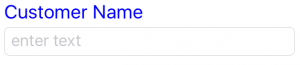
{type:short text ; label:Customer Name}
This tag will display in the app as below. In the final version of the document, the value from the textbox will be added in place of the tag.
type:long text
long text is for longer paragraphs that you want to add, such as describing the problem you see or details of the job. The text inserted here can be as long as you need.
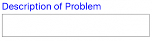
{type:long text ; label:Description of Problem}
This tag will display in the app as below. In the final version of the document, the value from the textfield will be added in place of the tag.
type:image
Images are easily added to the document from the app. This is one of the most powerful and time saving features of this app.
Simply add the type and unique label with an example square image, ensuring the end brace is after the image, as shown below:
{type:image ; label:Image To Add ;  }
}
type:option
option, is a great way to limit the choices for the user to quickly input the information that is needed. Option is broken down into two parts: the labels that will be displayed for the user to select and the details that will be added to the document depending on the option selected. This input method is perfect for when only specific text is wanted in the document.
{type:option ; label:Roof Type ; optionlabels:One/Two/Three ; optiondetails:One/Two/Three}
Note: the tag can be created without option details. For example:
{type:option ; label:Roof Type ; optionlabels:One/Two/Three}
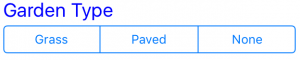
Option can also be used to input different sentences like in the example below:
{type:option ; label:Garden Type ; optionlabels:Grass/Paved/None ; optiondetails:The garden is laid to grass./The garden is paved./The property has no garden.}
This tag will display in the app as below. In the final version of the document, the value from the option details will be added in place of the tag.
type:list
list, is a great way to limit the choices for the user to quickly input the information that is needed. This input method is perfect for when only specific text is wanted in the document.
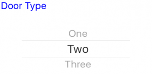
{type:list ; label:Door Type ; listlabels:One/Two/Three}
This tag will display in the app as below. In the final version of the document, the value from the list will be added in place of the tag.
type:select
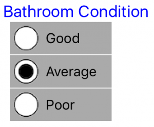
select is an easy way for the user to select the data that is needed in the report, along with the report displaying all options, indicating the one that is selected.
{type:select ; label:Bedroom Condition ; selectlabels:Good/Average/Poor}
This tag will display in the app as below. In the final version of the document, all labels will be shown, with indication of the selected label.
type:tickboxes
tickboxes is an easy way for the user to multi-select the data that is needed in the report, along with the report displaying all options, indicating which are selected.
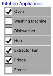
{type:tickboxes ; label:Kitchen Appliances ; ticklabels:Oven/Washing Machine/Dishwasher/Hob/Extractor Fan/Fridge/Freezer}
This tag will display in the app as below. In the final version of the document, all labels will be shown, with indication of the selected labels.
type:integer
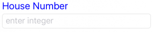
integer will be shown in a short textbox similar to Short Text. However, the number pad will open when the textbox is selected to be edited. This is to help the user add the required data as easily as possible.
{type:integer ; label:House Number}
This tag will display in the app as below. In the final version of the document, the value from the textbox will be added in place of the tag.
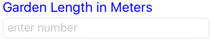
type:number
number will be shown in a short textbox similar to Short Text. However, the number pad will open when the textbox is selected. This is to help the user add the required data as easily as possible. This is very similar to Integer, however, it can include decimal places. For more details refer to the Error Checking section.
{type:number ; label:Garden Length in Meters}
This tag will display in the app as below. In the final version of the document, the value from the textbox will be added in place of the tag.
type:shared
Template Mobilizer gives you the ability to have multiple templates, and therefore multiple documents per Job. If there is a need for more than one document per Job, we have provided a way to enter specific data just once for several documents. For example:
{type:shared ; label:Customer Name}
There are a number of shared fields in this section, not all of which need to be used. Simply add these in the label element of a shared tag type as above. Find the list of common elements below:
Customer Name
Customer Company
My Name (Remembered from last time saved, editable)
Customer Address1
Customer Address2
Customer Town
Customer Postcode
Your Ref
Our Ref
Date (set at time document created, editable)
Time (set at time document created, editable)
type:equalto
If you need the same data more than once in the document, don’t worry you do not need to input this more than once. There is a simple tag to use, example below:
{type:equalto ; label:Customer Name}
Simply put the type as “equalto”, along with the exact label and data group of the data you want to repeat in the document.
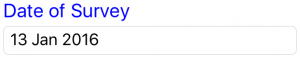
type:date
date is set as the date the document is created. This can be edited by the app user.
{type:date ; label:Survey Date}
type:time
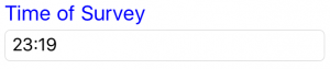
time is set as the date the document is created. This can be edited by the app user.
{type:time ; label:Survey Time}